


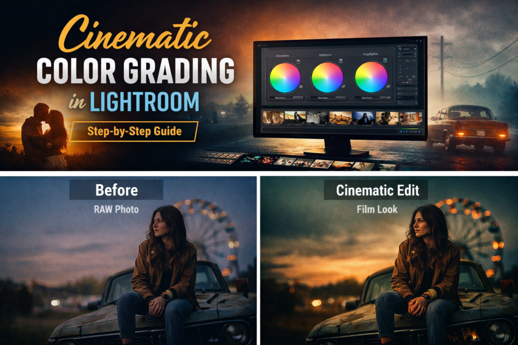
Cinematic color grading in Lightroom has become one of the most popular editing styles in modern photography. From Instagram creators to professional photographers, everyone wants that dramatic film-style look that makes images feel like scenes from a movie.
The good news is that you don’t need complex tools. With Adobe Lightroom and the right techniques, you can achieve stunning cinematic color grading in just a few minutes.
In this step-by-step guide, you will learn exactly how to create cinematic color grading in Lightroom, with professional tips used by real photographers.
What Is Cinematic Color Grading in Lightroom?
Cinematic color grading in Lightroom is an editing technique that mimics the color tones used in movies and film productions.
It typically includes:
- Deep, lifted shadows
- Soft and controlled highlights
- Film-style color tones (teal and orange)
- Dramatic contrast with a matte finish
- Subtle vignette and grain
This style is popular across portrait, travel, street, and fashion photography. Many photographers use cinematic Lightroom presets to apply this look instantly and consistently across their work.
For a deeper technical overview of how Lightroom’s color tools work, Adobe’s official Lightroom documentation is an excellent reference.
Step 1: Adjust Exposure and Contrast
Before applying any cinematic color grading in Lightroom, start with the basic panel adjustments.
In the Basic Panel, adjust:
- Exposure — Set your overall brightness
- Contrast — Increase slightly for a dramatic look
- Highlights — Pull down to recover sky and bright areas
- Shadows — Lift slightly to create a soft, cinematic feel
- Whites and Blacks — Fine-tune for a controlled tonal range
Cinematic photos typically have slightly darker shadows and tightly controlled highlights. This creates a rich, dramatic look without blowing out the image.
Step 2: Adjust White Balance for a Cinematic Feel
White balance has a major impact on cinematic color grading in Lightroom.
For a warm cinematic tone, try:
- Temperature — Shift slightly warmer (toward 5500–6500K)
- Tint — Add a subtle magenta shift
For a cool moody cinematic look, go the opposite direction with cooler temperatures and a slight green tint.
The goal is to set a foundation for your color grade before applying more advanced techniques.
Step 3: Use the Tone Curve — The Heart of Cinematic Color Grading
The Tone Curve is the most powerful tool for cinematic color grading in Lightroom.
To create a cinematic curve:
- Lift the bottom-left shadow point slightly — this creates the matte “lifted blacks” look common in films
- Lower the top-right highlight point slightly — this softens the highlights
- Create a gentle S-curve — this adds contrast to the midtones
This single adjustment is responsible for the classic cinema look that separates amateur edits from professional ones.
Step 4: Use the HSL Panel to Control Individual Colors
The HSL (Hue, Saturation, Luminance) panel lets you adjust individual color channels to refine your cinematic color grade.
Common cinematic HSL adjustments:
- Greens — Reduce saturation slightly (removes distracting green casts)
- Blues — Shift hue toward teal (creates the famous teal shadow look)
- Oranges — Adjust hue and luminance for natural, flattering skin tones
- Aquas — Boost to enhance teal tones in shadows
These subtle shifts are what create the famous teal and orange cinematic look used in Hollywood productions.
Step 5: Apply Color Grading to Shadows, Midtones, and Highlights
Lightroom’s dedicated Color Grading panel (formerly Split Toning) allows you to add specific colors to different parts of the tonal range.
Classic cinematic combinations:
- Shadows → Teal or cool blue
- Highlights → Warm orange or golden tones
- Midtones → Soft neutral or slight warm tones
This technique gives your photos the signature cinematic color balance used in major film productions. Even subtle adjustments here make a dramatic difference in the final result.
Step 6: Add Vignette and Film Grain
To complete your cinematic color grading in Lightroom, add two finishing touches in the Effects panel:
Vignette: Darkening the edges draws attention toward the subject. Keep it subtle — around -15 to -25 — for a natural look.
Film Grain: Adding a small amount of grain (Amount: 15–25, Size: 25–35) simulates the texture of real film and adds a tactile, authentic quality to digital photos.
These details transform a technically good edit into something that feels genuinely cinematic.
The Fastest Way to Apply Cinematic Color Grading
While learning manual techniques is valuable, many photographers prefer using professional cinematic Lightroom presets to speed up their workflow.
Presets allow you to:
- Apply cinematic color grading in Lightroom with a single click
- Maintain a consistent style across hundreds of photos
- Edit entire sessions in a fraction of the time
- Experiment with multiple cinematic looks instantly
At Camegraphy, our professional Lightroom preset collections include cinematic, warm, moody, and film-inspired styles — all tested across different camera brands and lighting conditions.
Pro Tips for Better Cinematic Photography
To get the most from your cinematic color grading in Lightroom, keep these tips in mind:
Shoot in RAW — RAW files give you much more latitude when pulling back highlights or lifting shadows during the grade.
Use directional lighting — Cinematic photos work best with side lighting or backlighting rather than flat front lighting.
Keep saturation controlled — Cinematic editing is typically desaturated compared to standard photography. Avoid punchy, oversaturated looks.
Focus on mood and atmosphere — Great cinematic photos tell a story. Think about how your color grade supports the emotion you want to convey.
Why Cinematic Color Grading Is So Popular
Cinematic color grading in Lightroom has exploded in popularity because it makes photos feel more emotional, dramatic, and memorable.
Social media creators, wedding photographers, portrait artists, and travel bloggers all rely on cinematic editing to make their content stand out in competitive feeds.
Using a well-crafted cinematic Lightroom preset allows photographers of any skill level to achieve this look consistently and professionally.
Final Thoughts
Cinematic color grading in Lightroom is one of the most powerful ways to transform ordinary photos into dramatic visual stories.
By combining:
- Tone Curve adjustments for lifted shadows
- HSL color control for teal and warm tones
- Color Grading panel for shadow and highlight tinting
- Vignette and film grain for a finished cinematic look
…you can create stunning cinematic photos in just minutes.
If you want to skip the manual process and apply professional cinematic grades instantly, explore our Lightroom preset collections at Camegraphy and upgrade your editing workflow today.