


10 Photography Composition Rules Every Beginner Must Know in 2026
Master these timeless composition techniques and transform your photos from snapshots into compelling images — starting today.
If you’ve ever looked at a professional photograph and wondered why it feels so different from your own photos — the answer is almost always composition. Not the camera. Not the lens. Not even the lighting. Composition.
Photography composition is the art of arranging the elements within your frame to create a visually powerful image. And the good news? Composition can be learned. Unlike talent, it’s a set of rules and principles that any photographer — regardless of gear or experience — can apply immediately.
In this guide, you’ll learn the 10 most important photography composition rules for beginners, with practical examples for every shooting situation from portraits and weddings to real estate and street photography.
Rules in photography exist to be understood — and sometimes broken. But you must know the rules before you break them. Master these 10 principles first, and then experiment freely.
The single most important composition rule in photography
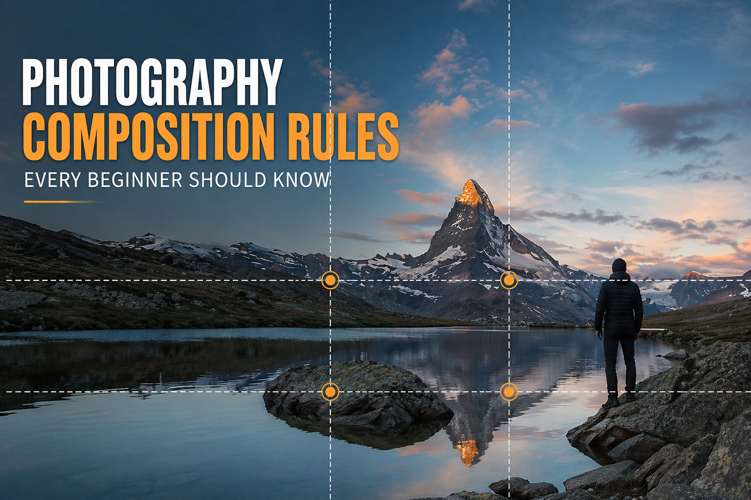
Imagine dividing your image into a 3×3 grid — two horizontal lines and two vertical lines creating nine equal rectangles. The rule of thirds states that your subject or the most important elements of your scene should be placed along these lines or at the four intersection points — called power points or crash points.
Why does this work? Because placing your subject dead-center creates a static, predictable image. Shifting it to one of the intersection points creates natural tension, movement, and visual interest that draws the viewer’s eye through the frame.
How to use it: Enable the grid overlay on your camera or smartphone — almost every camera has this built in. When shooting portraits, place the eyes on the top horizontal line. For landscapes, put the horizon on either the top or bottom third line. For subjects moving through the frame, give them space to “move into” by placing them on the side third facing the direction of movement.
For wedding photography, place the couple at one of the left or right intersection points and use the remaining two-thirds of the frame to capture the venue, sky, or natural background. This tells a story beyond just the subjects.
Guide the viewer’s eye directly to your subject
Leading lines are one of the most powerful tools in photography composition. They are lines within the scene — roads, fences, rivers, staircases, hallways, shorelines — that naturally draw the viewer’s eye from the edge of the frame toward the subject or focal point.
Our eyes naturally follow lines. When a photographer places a leading line in their composition, they’re essentially installing a visual pathway that guides the viewer through the image in exactly the order the photographer intended.
Types of leading lines: Straight lines create a sense of direction and speed. Curved or S-shaped lines feel more relaxed and organic — a winding path through a forest, a river bend. Converging lines that meet at a vanishing point (like train tracks or a hallway) create dramatic depth and perspective.
Where to find them: Roads and pathways, fences and walls, rivers and shorelines, shadows, rows of trees or columns, even the gaze direction of a person in your frame — all eyes in a photo act as leading lines directing the viewer toward whatever the subject is looking at.
In real estate photography, use leading lines aggressively. A hallway leading to the master bedroom, a countertop edge pointing toward the kitchen island, a pathway leading to the front door — these lines make spaces feel larger and draw buyers into the image.
Use the environment to create a frame within your frame
Natural framing means using elements within your scene to create a secondary frame around your subject. This technique adds depth, context, and a sense of intimacy that draws the viewer’s eye directly to the subject while making the overall image feel more layered and intentional.
Natural frames include doorways and windows, tree branches overhead, archways and tunnels, cave openings, or even the arms and shoulders of people in the foreground. The frame doesn’t need to be a perfect rectangle — any element that surrounds or partially encircles your subject can function as a natural frame.
Why it works: Frames within frames create visual hierarchy. The outer frame tells the viewer “look inside here.” They add depth by placing foreground elements in front of your subject. They also add context — a subject photographed through a doorway is immediately in a specific location, which makes the image more narrative.
For portrait photographers: shoot a subject through a window, with curtains visible on either side. For wedding photographers: position the couple inside an archway or between two trees. For real estate: shoot a room through a doorway from the hallway for an immediate sense of depth.
Create order, and then break it intentionally
Symmetry is immediately satisfying to the human eye. When the left side of an image mirrors the right — or the top mirrors the bottom — the brain recognizes order and finds it visually pleasing. Symmetrical compositions work particularly well for architecture, reflections, and formal portraits.
Reflections on water surfaces, the facade of a grand building, a perfectly mirrored hotel lobby, a long corridor — these are all natural opportunities for symmetrical composition. For reflections, place the horizon dead-center to divide the frame equally between the real world and its mirror image.
Patterns are a related concept — repeating elements (windows on a building, tiles on a floor, flowers in a field) create a satisfying rhythm. The most powerful use of pattern in photography is to break it: place a single red flower in a field of white ones, or one person walking against a crowd moving in the opposite direction. The disruption of a pattern is what your eye immediately goes to.
Beginners often avoid center placement entirely after learning the rule of thirds. But symmetrical subjects — a cathedral facade, a reflection shot — actually demand a centered composition. Know when each rule applies.
Turn flat images into three-dimensional stories
Photography is inherently a 2D medium — we’re capturing a 3D world onto a flat sensor. Creating a sense of depth is what separates a photograph that feels immersive from one that feels flat and lifeless.
The most effective way to create depth is through three distinct layers: foreground, midground, and background. When all three are present and visually distinct, the image has a sense of three-dimensional space that pulls the viewer in.
In landscape photography: place rocks, flowers, or grass in the foreground; your main subject (a lake, a mountain) in the midground; and the sky or distant mountains in the background. In portrait photography: shoot in a location where there are visible elements in front of and behind your subject — a garden with flowers in the foreground and trees behind creates beautiful depth.
Depth of field is your technical tool for controlling this. A shallow depth of field (wide aperture, f/1.8–f/2.8) keeps the subject sharp while blurring both foreground and background, creating creamy separation. A deep depth of field (narrow aperture, f/8–f/16) keeps all three layers sharp, ideal for landscapes where you want every detail visible.
The power of what you leave out
Negative space is the empty area around and between your subjects. It sounds counterintuitive — leaving most of your frame empty — but negative space is one of the most powerful compositional tools available because it forces all attention onto the subject and creates a strong emotional response.
A lone figure walking across a vast empty beach. A single flower against a white wall. A bird in flight against a featureless gray sky. In each case, the emptiness amplifies the subject — it creates a feeling of solitude, scale, simplicity, or serenity that a busy, cluttered composition cannot achieve.
How to use it: Shoot a subject against a clean, simple background — a clear sky, a calm body of water, a plain wall. Position your subject in the bottom third or side third of the frame, leaving the rest deliberately empty. This works exceptionally well for social media content where simplicity reads powerfully on a small screen.
Negative space compositions perform exceptionally well on Instagram because they’re visually clean at thumbnail size. When designing content for Nostalgia Studio or your own social portfolio, use negative space shots as anchor posts in your grid.
The mathematical formula behind the most beautiful art
The golden ratio (approximately 1:1.618) is a mathematical relationship that appears throughout nature — in the spiral of a nautilus shell, the arrangement of sunflower seeds, the proportions of the human face. For centuries, artists and architects have used it as the foundation of aesthetically pleasing compositions.
In photography, the golden ratio is often expressed as the Fibonacci spiral — a spiral that coils from the corner of the frame inward toward a focal point. The ideal placement for your subject is at the center of this spiral, with the rest of the scene flowing outward along the curve.
The golden ratio produces slightly more organic, less rigid compositions than the rule of thirds — because it’s based on a curve rather than a grid. Many photographers find that portraits and nature shots benefit particularly from the golden spiral, while the rule of thirds remains more practical for fast-paced shooting situations.
Practical use: Most camera grid overlays offer both the rule of thirds and the golden ratio grid — switch between them depending on your subject. For portraits, try the golden spiral and position the subject’s eye at the center of the spiral.
Get closer. Then get even closer.
One of the most common beginner mistakes in photography is not getting close enough to the subject. The result is an image where the main subject is small and surrounded by distracting background elements that steal attention and dilute the visual impact.
Filling the frame means moving close enough — physically or with your zoom — that your subject occupies most or all of the frame. This eliminates distracting backgrounds, creates intimacy, and forces the viewer to engage directly with the subject’s details, textures, and expressions.
For portrait photography, a tightly cropped face fills the frame with emotional intensity — you can see every detail of the eyes, every emotion in the expression. For product photography or food photography, filling the frame shows texture, quality, and detail that a wider shot would miss. For event photography, moving into the crowd and filling the frame with faces captures energy and atmosphere that a distant wide shot cannot.
The rule: Whatever distance feels right to you as a beginner — halve it. Move twice as close. Then see if the image improves. In most cases, it will.
Why three is always better than two or four
The rule of odds states that images with an odd number of subjects — 1, 3, 5 — are more visually interesting than images with even numbers. This is because even numbers of subjects create symmetry and balance, which is stable but static. Odd numbers create dynamic tension — the eye moves between subjects without settling into a fixed, predictable pattern.
Three is the magic number in photography. Three people in a portrait. Three flowers in a vase. Three rocks on a beach. The brain naturally creates a triangle between three subjects, which gives the eye a path to travel and keeps it engaged longer than a simple side-by-side pair.
When photographing a group of two people (a couple, for example), consider adding a third element — a prop, a pet, a child, or even a strong foreground element — to break the symmetry and add visual interest. For product flat lays, always arrange items in groups of three or five rather than two or four.
When photographing the wedding party, break the group into smaller compositional groups of three rather than lining everyone up. This creates more dynamic, editorial-feeling images compared to the traditional row portrait.
The most transformative compositional tool costs nothing
Most beginner photographers shoot everything from the same position: standing upright, camera at eye level. The result is technically correct but visually predictable — because it’s the same perspective every human being sees the world from every day.
Changing your viewpoint — the angle and height from which you shoot — is the single most transformative compositional decision you can make, and it costs nothing except the willingness to crouch, climb, or lie on the ground.
Shoot low: Getting down to ground level and shooting upward creates drama and power — subjects appear larger and more imposing, and you reveal foreground details that eye-level shots miss entirely. Children photographed at their eye level (not yours) look natural and relatable rather than dominated.
Shoot high: An elevated viewpoint — standing on a chair, climbing stairs, using a drone — reveals patterns, shapes, and spatial relationships that are invisible from the ground. Overhead (flat lay) shots completely eliminate perspective and create striking, graphic compositions.
Shoot at 45 degrees: Tilting your camera slightly — a technique called a Dutch angle — creates a sense of tension, unease, or dynamic movement. Use sparingly, but effectively, for action shots or to convey psychological intensity in portraits.
Before every shot, ask yourself: “Is there a more interesting angle for this?” Then try at least two or three different viewpoints before deciding. The first instinct is rarely the best shot.
Quick Reference: All 10 Rules at a Glance
| Rule | Best For | Key Technique | Difficulty |
|---|---|---|---|
| Rule of Thirds | Everything — universal | Enable grid overlay, place subject on intersections | Beginner |
| Leading Lines | Landscapes, architecture, streets | Find natural lines that point to your subject | Beginner |
| Natural Framing | Portraits, travel, weddings | Shoot through doorways, arches, branches | Beginner |
| Symmetry & Patterns | Architecture, reflections | Center your subject; break patterns deliberately | Beginner |
| Depth & Layers | Landscapes, portraits, real estate | Create foreground, midground, background | Intermediate |
| Negative Space | Minimalist, social media, concepts | Shoot against clean, uncluttered backgrounds | Beginner |
| Golden Ratio | Portraits, nature, fine art | Use Fibonacci spiral grid overlay | Intermediate |
| Fill the Frame | Portraits, products, events | Move twice as close as feels natural | Beginner |
| Rule of Odds | Groups, products, still life | Compose in groups of 3 or 5 | Beginner |
| Change Viewpoint | Everything — universally applicable | Try ground level, elevated, and angled shots | Beginner |
How to Practice These Composition Rules
The 10-Shot Exercise
Pick one composition rule per week. Go out with your camera — or even your phone — and take 10 photographs that deliberately apply that one rule. Don’t worry about anything else. Just focus on that single principle. By the end of 10 weeks, you’ll have internalized all 10 rules instinctively.
Analyze Photos You Admire
Every time you see a photograph that stops you in your tracks — on Instagram, in a magazine, on a gallery wall — ask yourself: which composition rules is this photographer using? Look for the lines, the layers, the framing, the negative space. Reverse-engineering great photographs is one of the fastest ways to train your compositional eye.
Shoot the Same Subject Multiple Ways
Pick a simple subject — a coffee cup, a flower, a doorway — and photograph it 20 different ways using different composition rules, viewpoints, and distances. This forces you to exhaust your default instincts and discover angles you would never have found otherwise.
Edit With Intention
Good composition starts in-camera, but it can be refined in post-processing. Use the crop tool in Lightroom with the rule of thirds overlay enabled to re-compose your images after the fact. You’ll be amazed at how often a slight crop transforms an average shot into a strong one. Pair your composition practice with quality Lightroom presets to develop a consistent visual style across your portfolio.
When you apply a Lightroom preset to your images, strong composition makes the preset look 10x better. A well-composed shot with a cinematic preset becomes a portfolio-worthy image. A poorly composed shot with the same preset just becomes a nicer-looking mistake.
Frequently Asked Questions
Take Your Photos Further With Professional Editing
Great composition is the foundation. Professional editing is what transforms a well-composed shot into a truly stunning image. Explore Camegraphy’s collection of Lightroom presets, LUTs, and Photoshop actions.
Browse Camegraphy Shop →